Case Study: Legion of Honor Museum app
I was the UX lead on this project.
Goal
The goal is to make a dedicated app for the museum with a robust experience showcasing a wide selection of art found at the museum.
Target Audience
This app is designed for art lovers who want to have an understanding of the variety and quality of the art at the museum before they visit.
Challenges
Exhibits: There needs to be enough of a representation of the exhibit art that visitors can get an idea of what to expect before they visit
Collection: The permanent collection at the museum can be just as engaging as the temporary exhibits and showcasing a wide selection of the collection can inspire repeat visits
Membership: Membership is what helps the museum thrive and prosper. By keeping the option to join front and center, the museum can actively build their audience
Research Conducted
Interviews, paper and digital wireframing, low and high-fidelity prototypes, conducting usability studies, accounting for accessibility and iterating on designs
Low-Fidelity Mock-ups
After researching, creating user personas and doing a competitive analysis of museums, I built low-fidelity wireframes and prototypes.
Affinity Diagram
After building low-fidelity prototypes to test in my usability study, I created an affinity diagram to group similar feedback into clear buckets that then informed me about how to proceed with building high-fidelity prototypes.
High-Fidelity Mock-ups
Taking the learnings from my affinity diagram, I was able to build a high-fidelity mockup and prototype that functioned much more smoothly for the user.
Takeaways
The users appreciated the ability to view more artwork before going to the museum to give them a better idea of what they will experience. As one participant in my usability study mentioned, the app is really straightforward, simple, clean and easy for older users to experience. I learned that by diligently going through the design process from start to finish, I arrived at an improved experience for museum visitors.
Case Study: The Shoots App for Photographers
I was the UX lead on this project.
Goal
The goal is to make the lives of busy photographers easier and their process more streamlined.
Target Audience
This app is designed for photographers who have a lot of details to manage when planning their photoshoots. They need a program that keeps everything in one place, eliminating the need for other programs.
Challenges
Boards: The concept of boards and types of things that can be added to boards need to be clear to give users an idea of the range of possibilities
Teams: The possibilities of who the team can be, such as client or production team, should be spelled out
Labeling: The naming given to buttons and fields of descriptive copy leading to a desired action by users needs to be clear
Research Conducted
Interviews, paper and digital wireframing, low and high-fidelity prototypes, conducting usability studies, accounting for accessibility and iterating on designs
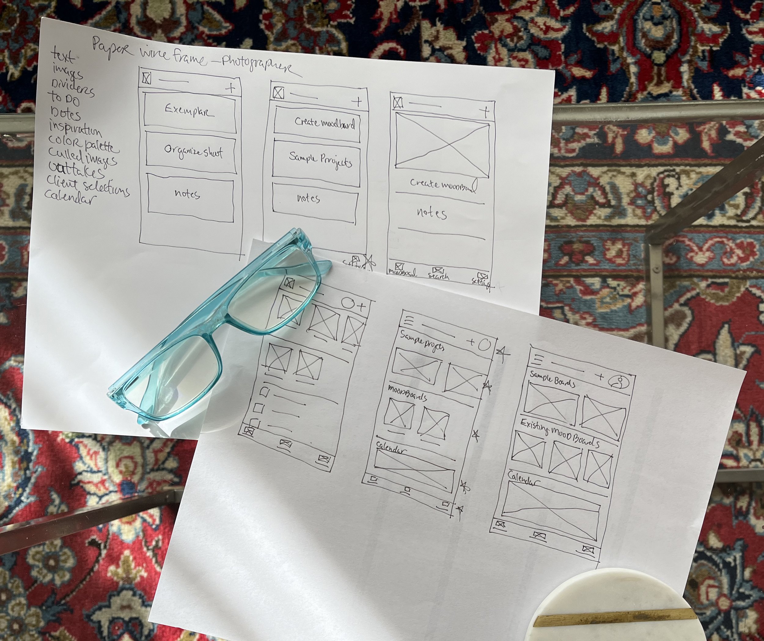
Paper Prototypes
Low-Fidelity Prototypes
I wanted to create an app that was easy to use — a board that photographers could just click on and then start to populate with the details of their photoshoots. This initial direction was a little too simplified. I learned from the usability study that people didn’t really understand what boards are. They also didn’t know which team members to add and if they could have multiple boards for the same shoot.
High-Fidelity Prototypes
I learned the value of copy. It’s one thing to be concise, but it’s another to choose the right words and also add more words if it makes the communication more clear. In this case I added more descriptive copy and that aided the usability. Next steps are to conduct another usability study to ensure users are flowing in the app the way it is intended to work.
Case study for the Shoots website
Project Vision
Shoots is a website for photographers who want a better way to organize their photoshoots. This site functions in tandem with the Shoots app that I’ve also developed.
Challenges
Create a cohesive interface for familiar and unfamiliar users
Boards should be front and center and easy to understand
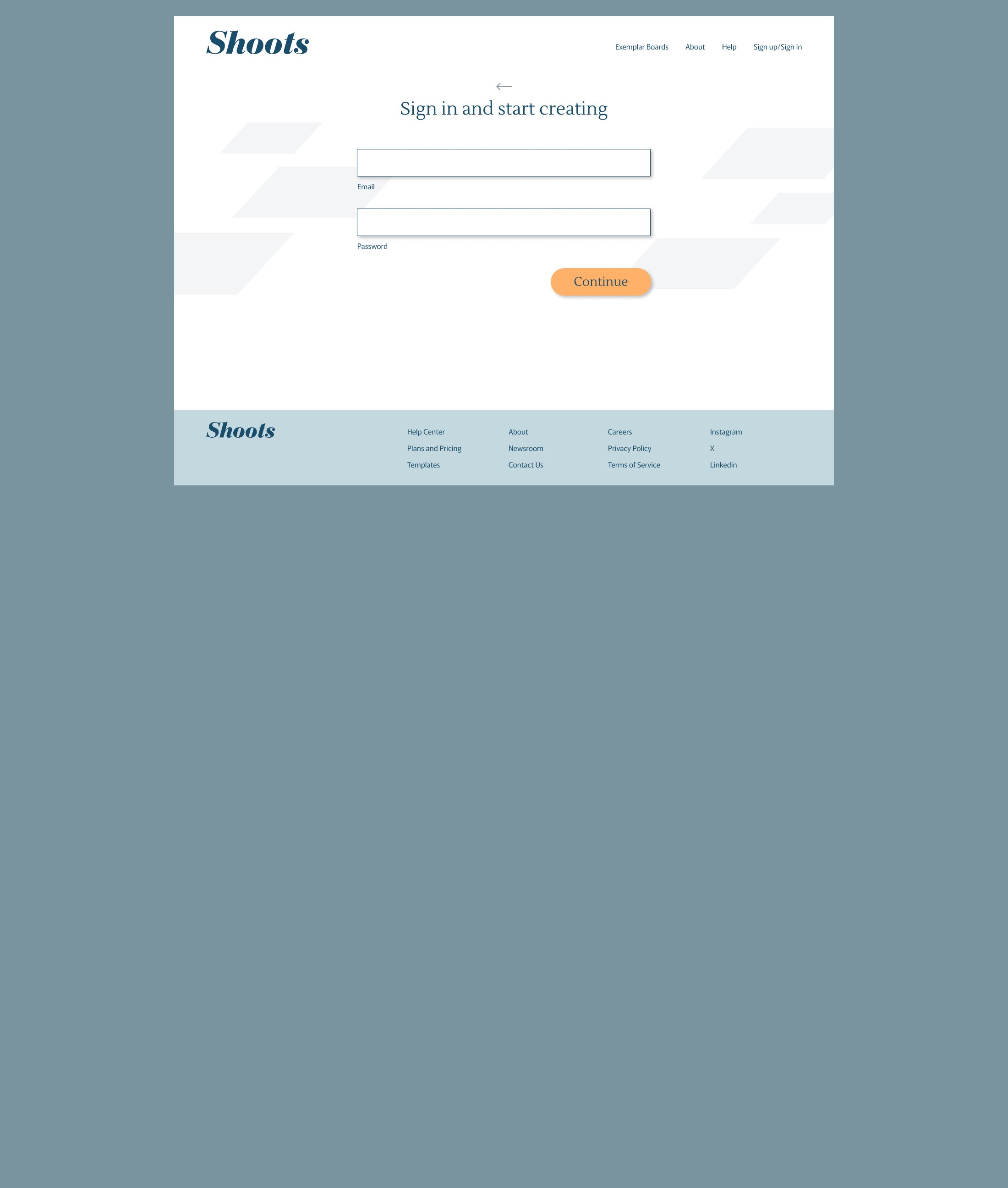
Ensure that the sign-up process and creation of teams is clear
Research Methods
Interviews, paper and digital wireframing, low and high-fidelity prototypes, conducting usability studies, accounting for accessibility and iterating on designs
Research Questions:
Is it easy for users to initiate the process of creating a board?
Does making the team one of the first things to select make sense?
Are there any steps that are missing or would be beneficial to add?
Are there any parts where the users are getting stuck?
Affinity Diagram
Competitive Analysis
I looked at several competing companies and Milanote is the closest competitor as they service creatives just as Shoots does, though shoots is more directly focused on photographers. Some of the features are the same though Milanote does not have the calendar feature and they don’t focus on creating teams as a key step in setting up boards. Trello, Miro and Mural are also competitors.
Low-Fidelity mockups
High-Fidelity mockups
As someone who works with photographers, I can see a need for a website such as Shoots. It’s a powerful tool to help them schedule their shoots while keeping the team on track. After working on both the app and website, I believe focusing on getting the team organized at the outset of creating boards is the way to go so the users can have multiple boards per project based on each dedicated team. I learned that the website design for Shoots is a lot more involved than the app design since it has more real estate and detail than the app.


